LandEscapes Literary Arts Journal
Refreshing LandEscapes
2023
main designer
Pullman, WA

Leveraging over two decades of tradition, LandEscapes is a student-run literary arts journal that is based at 20 years at Washington State University (WSU). The journal aims to serve the creative community at WSU by providing an annual platform that students from all four university campuses—Global, Pullman, Tri-Cities, and Vancouver—can submit to and be published in. This case study delves into the strategic design and merchandising initiatives undertaken to enrich the journal's legacy.
The student-centric nature of our organization facilitated constant collaboration among peers. Designs underwent thorough review and discussion, ensuring alignment with the collective vision.

LandEscapes as a club had already voted on the cover art out of our submission pool, so ensuring that selected typefaces represented the selected student work was the next goal.
The palette was devised off of the cover artwork, and the final typeface pairing was Sinoreta for titles and Sofia Pro as the body typeface.

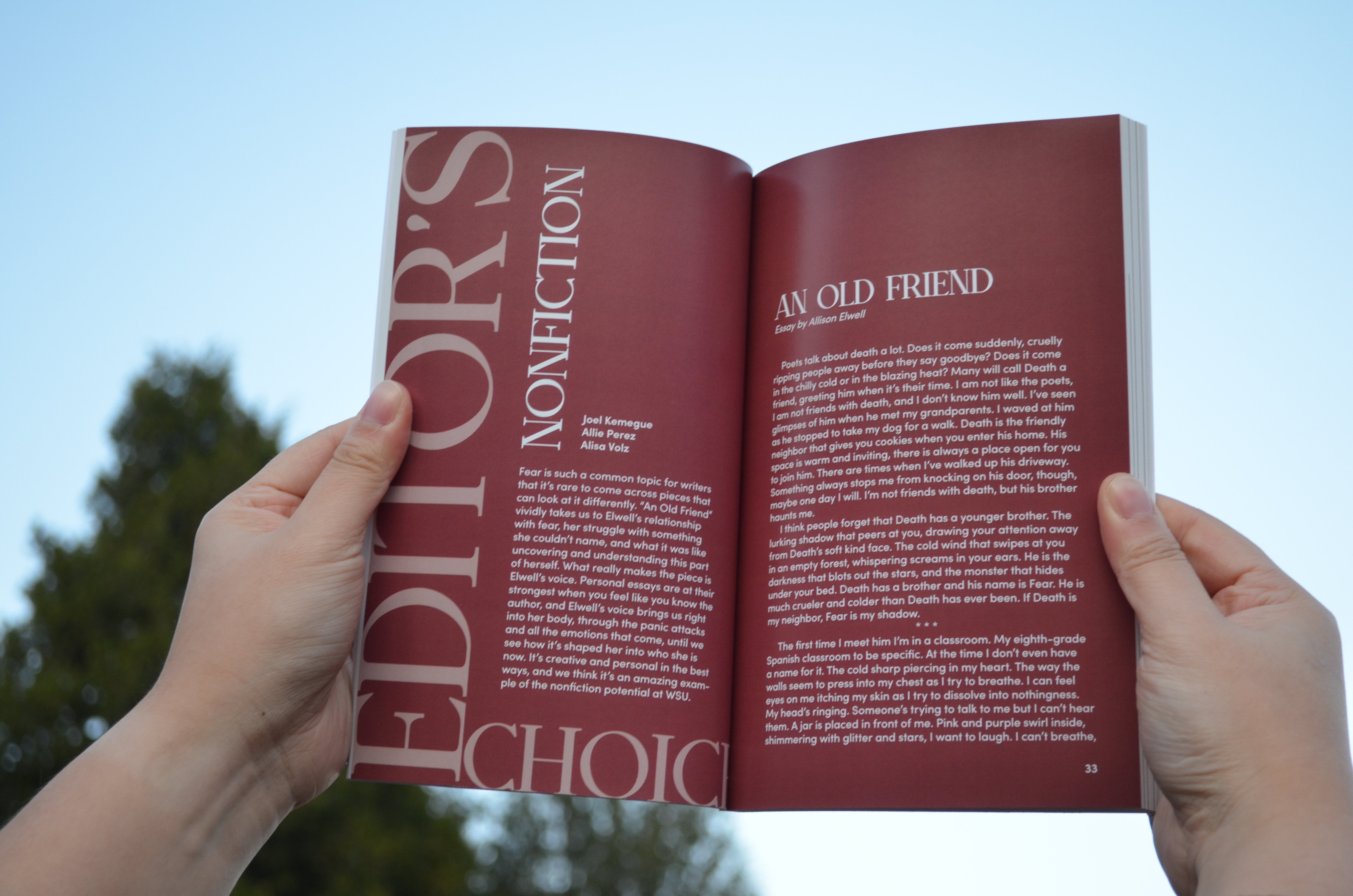
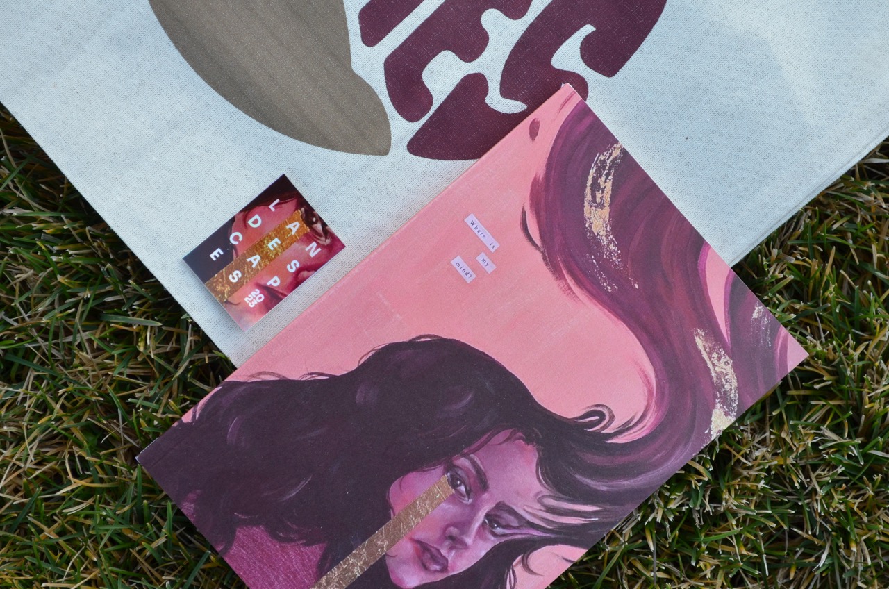
Then, collaboration with the copyediting team helped secure the final drafts for the InDesign file. Placing artwork submissions throughout the manuscript was the next step, and here's where I had fun: curating pairings between the written work and visual art that would enhance the overall experience for the reader.
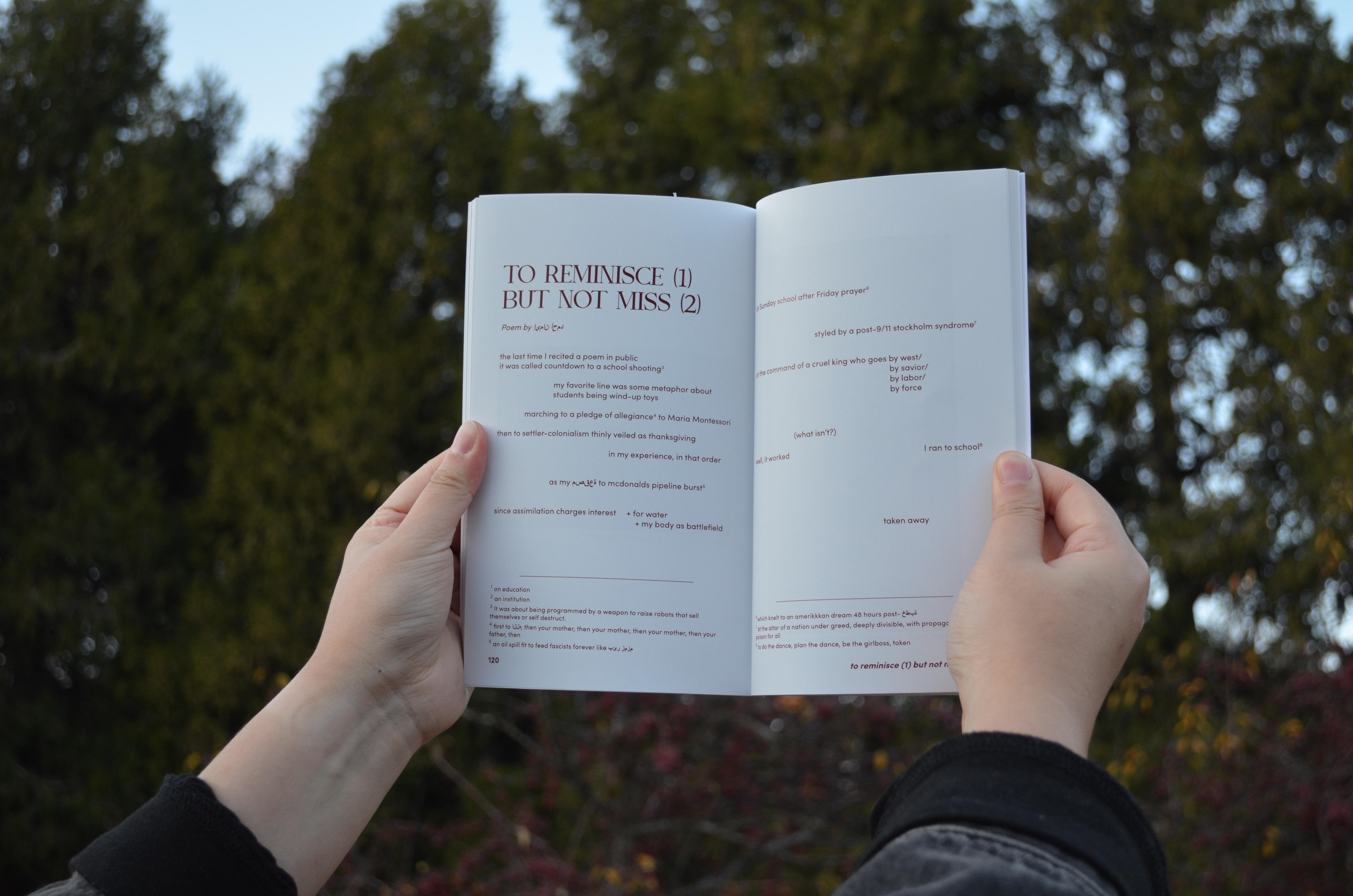
One standout piece in the 2023 edition was a poem partially written in Arabic. Despite the challenges of formatting multilingual content within English-dominated prose, I endeavored to preserve the authenticity and integrity of the original composition.
Despite a busy schedule involving intensive InDesign training and participation in a spring break event, I managed to balance priorities effectively. The immersive learning experiences and networking opportunities during this period left a lasting impression.
It was here that the club ran into a budget problem: if the money from the 2022-2023 budget was not spent in full, it would reduce the amount LandEscapes was allocated the incoming year, 2023-2024.
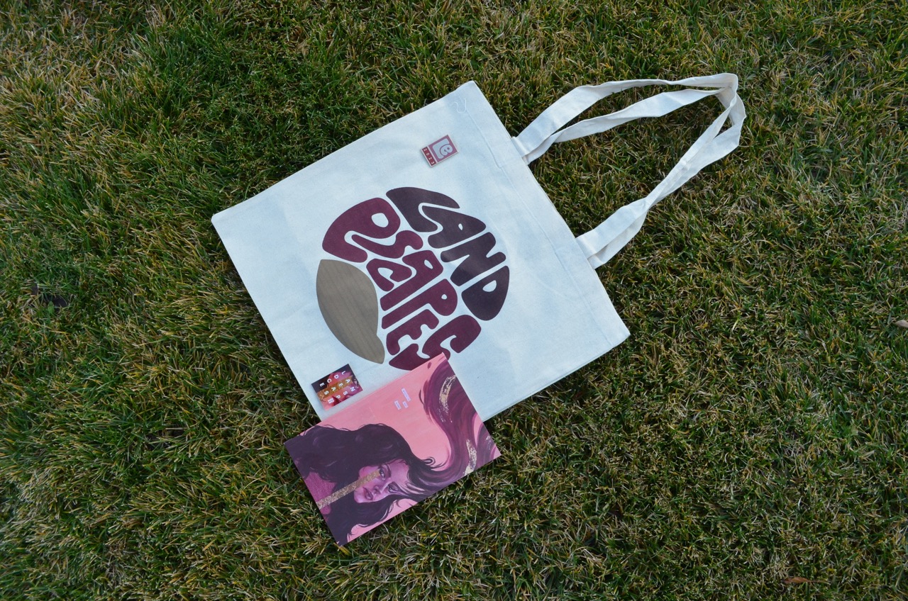
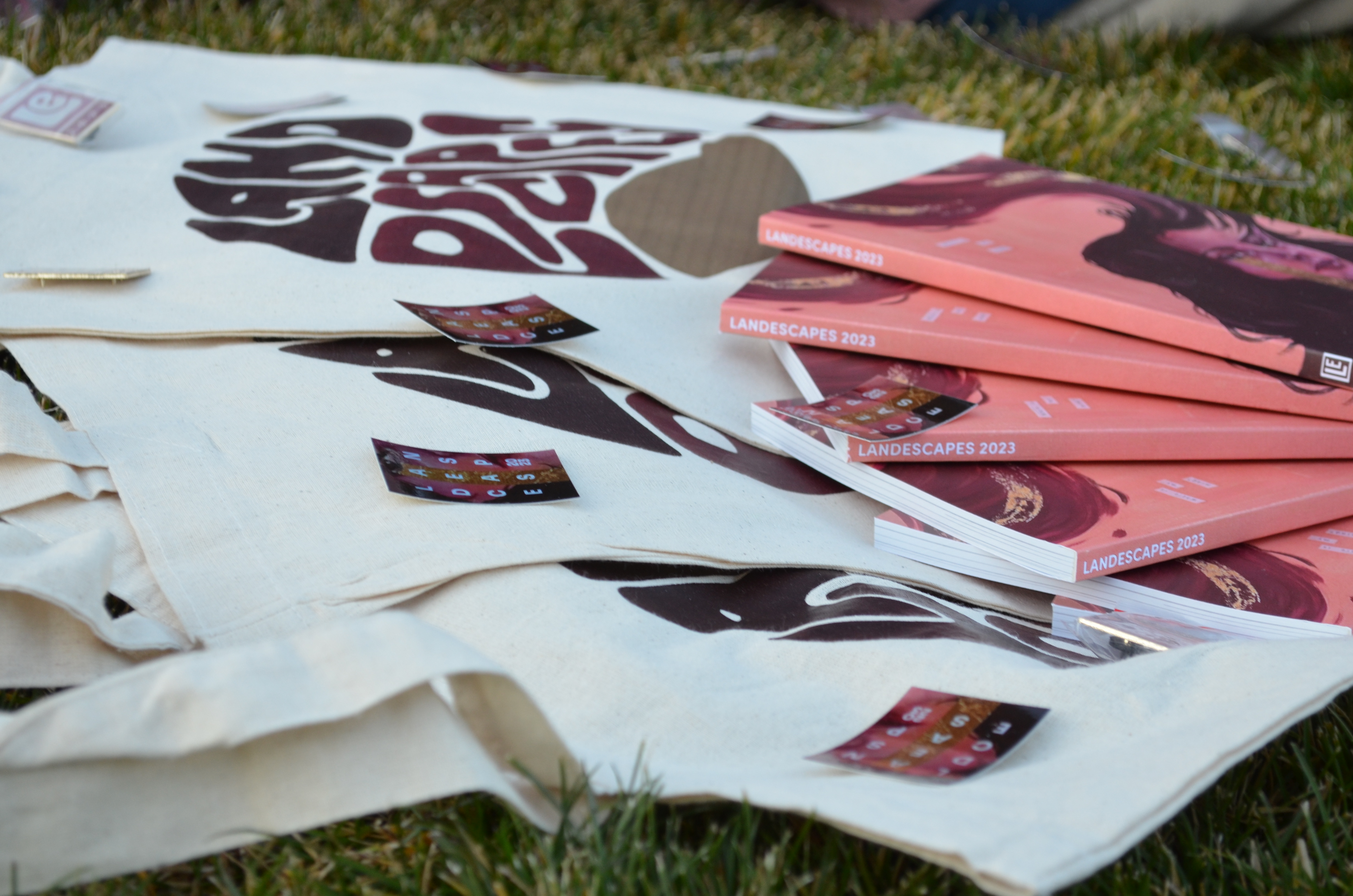
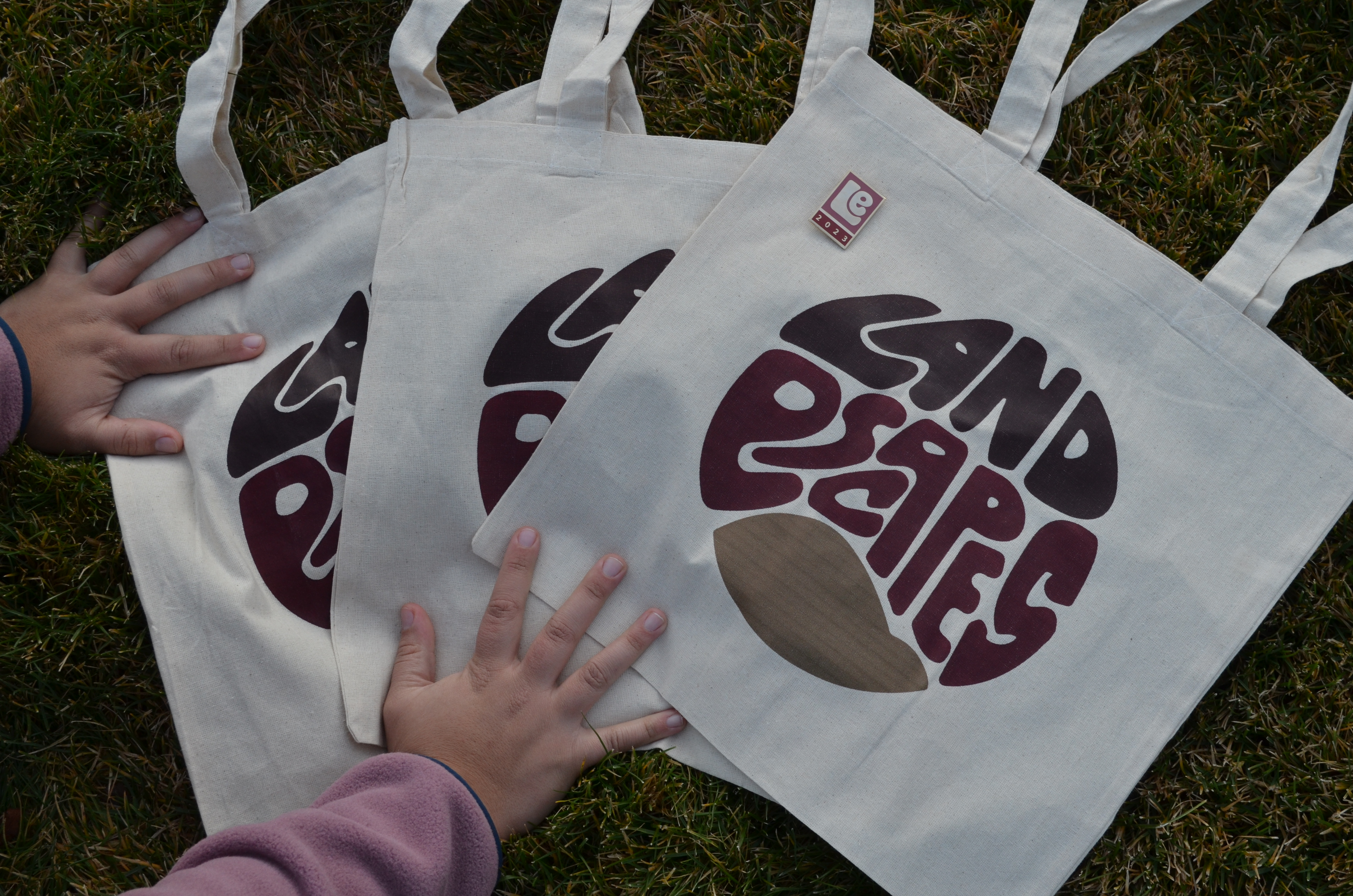
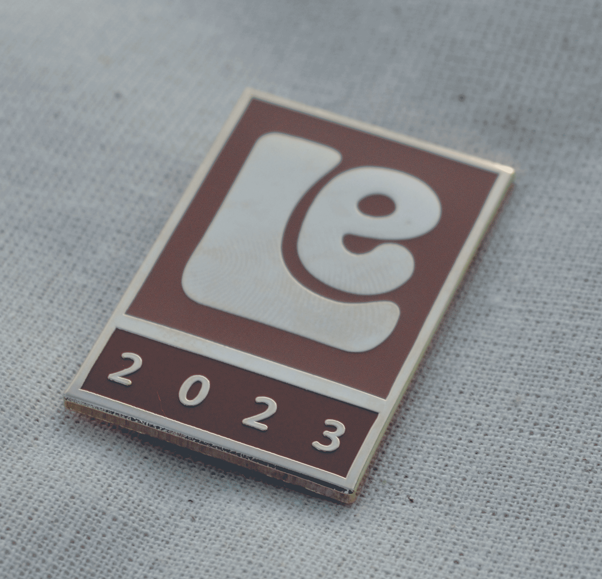
As a creative, I pitched merchandise. My peers agreed.
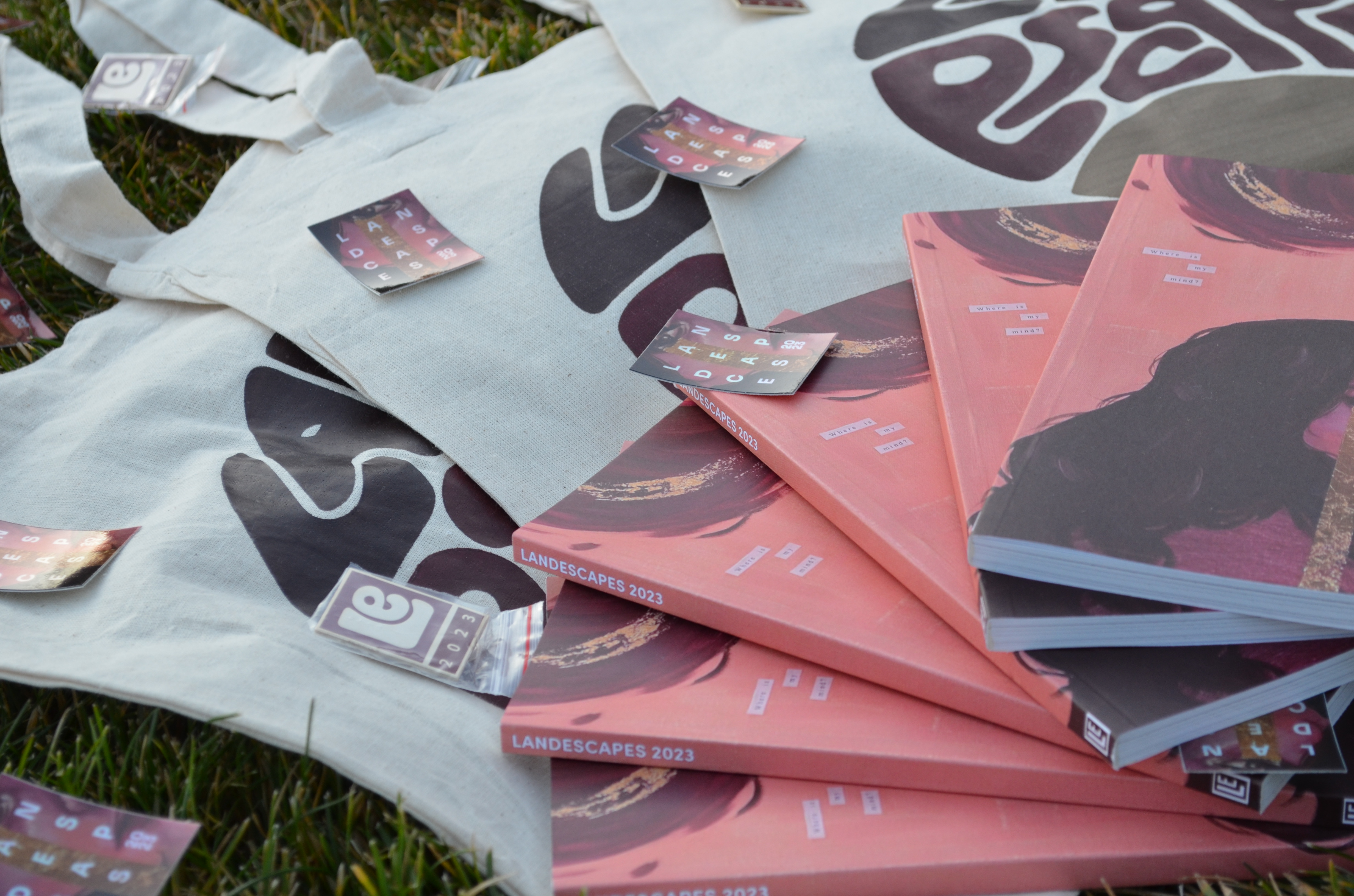
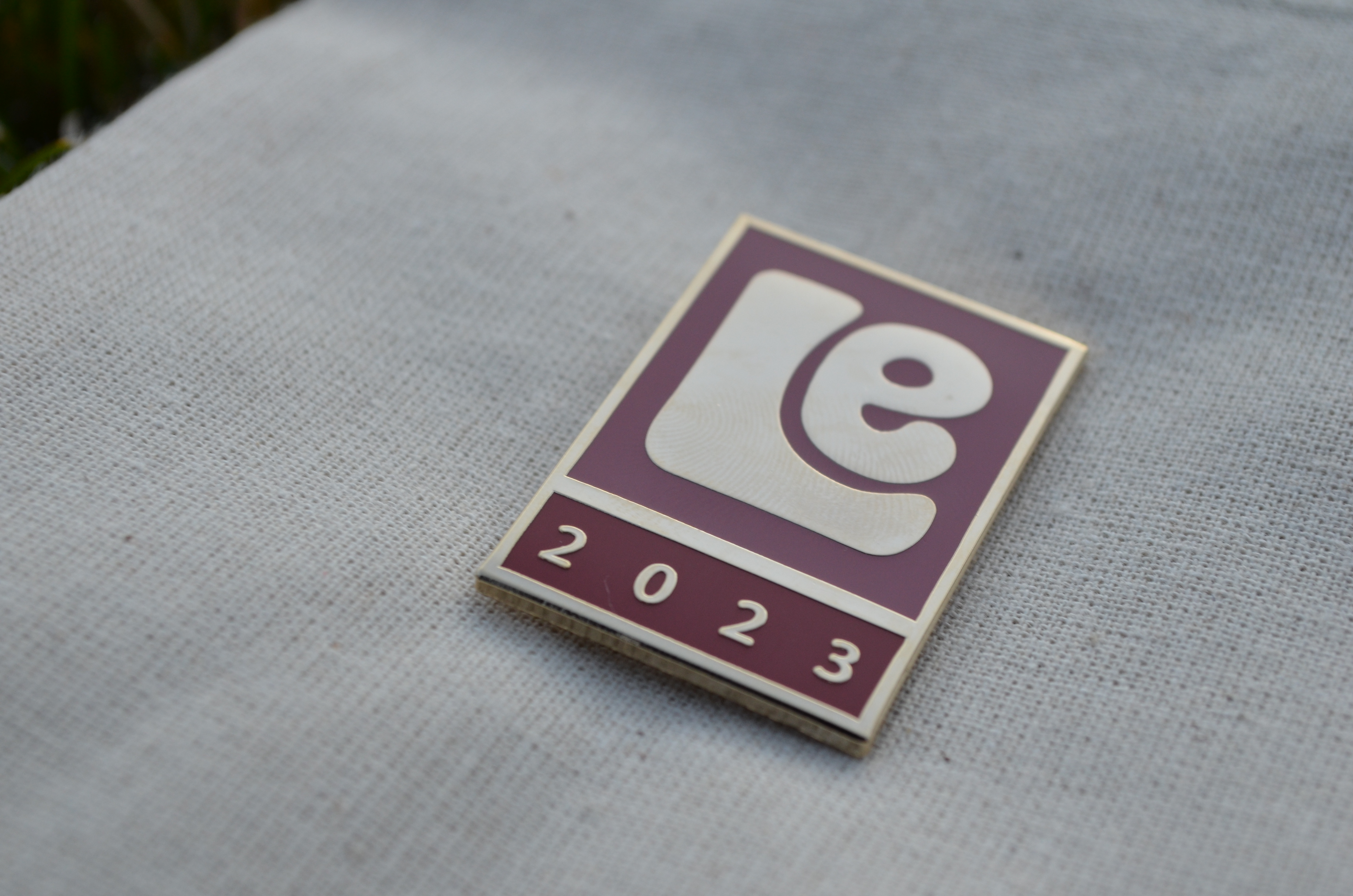
The abstract pin designs were inspired by collector pins at San Diego Comic Con. Every year at the convention has a new design made up of the same elements as the years prior, but the slight visual change inspires excitement and anticipation in con-goers like myself.
Replicating the timeless design that these pins hold was my goal. Once the pin design was decided, emanating the same timeless, anticipatory design within the stickers and tote bags was the next checkpoint.
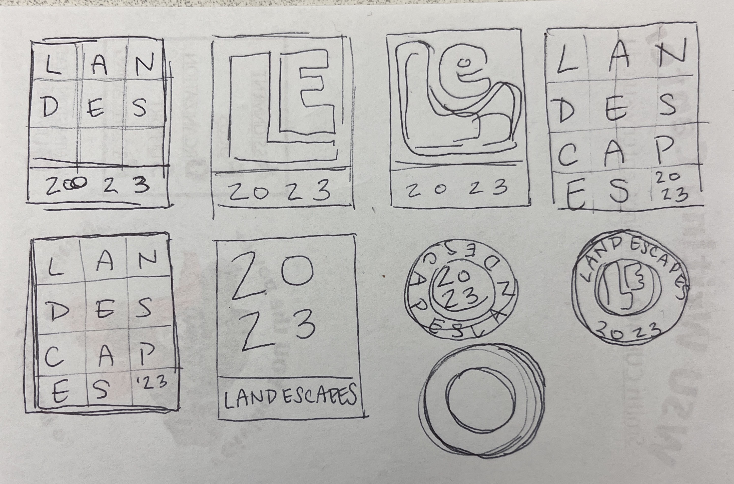
Each of the sketches below were created with the goal of visual stability and eventually, immediate recognition in mind.
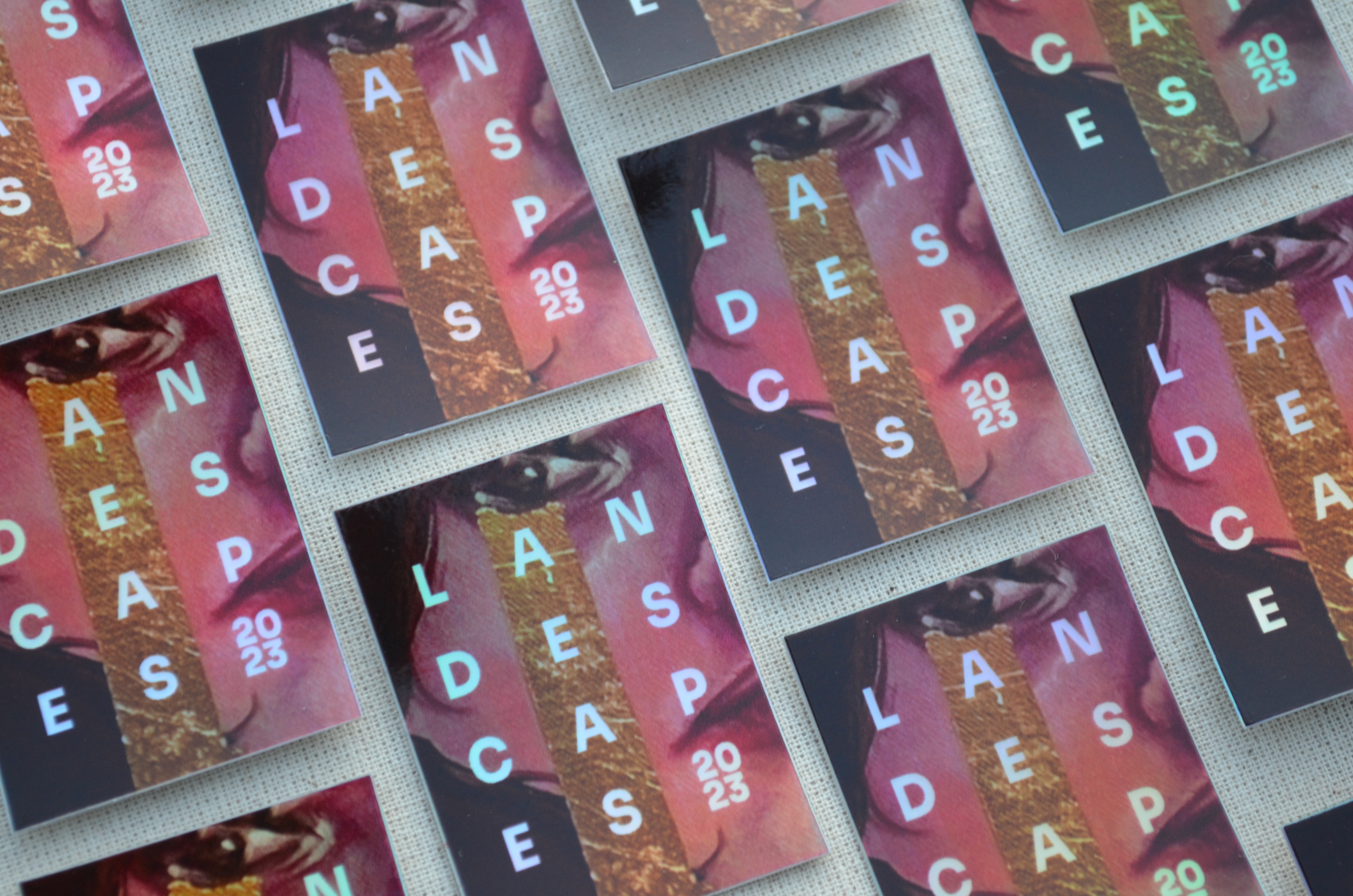
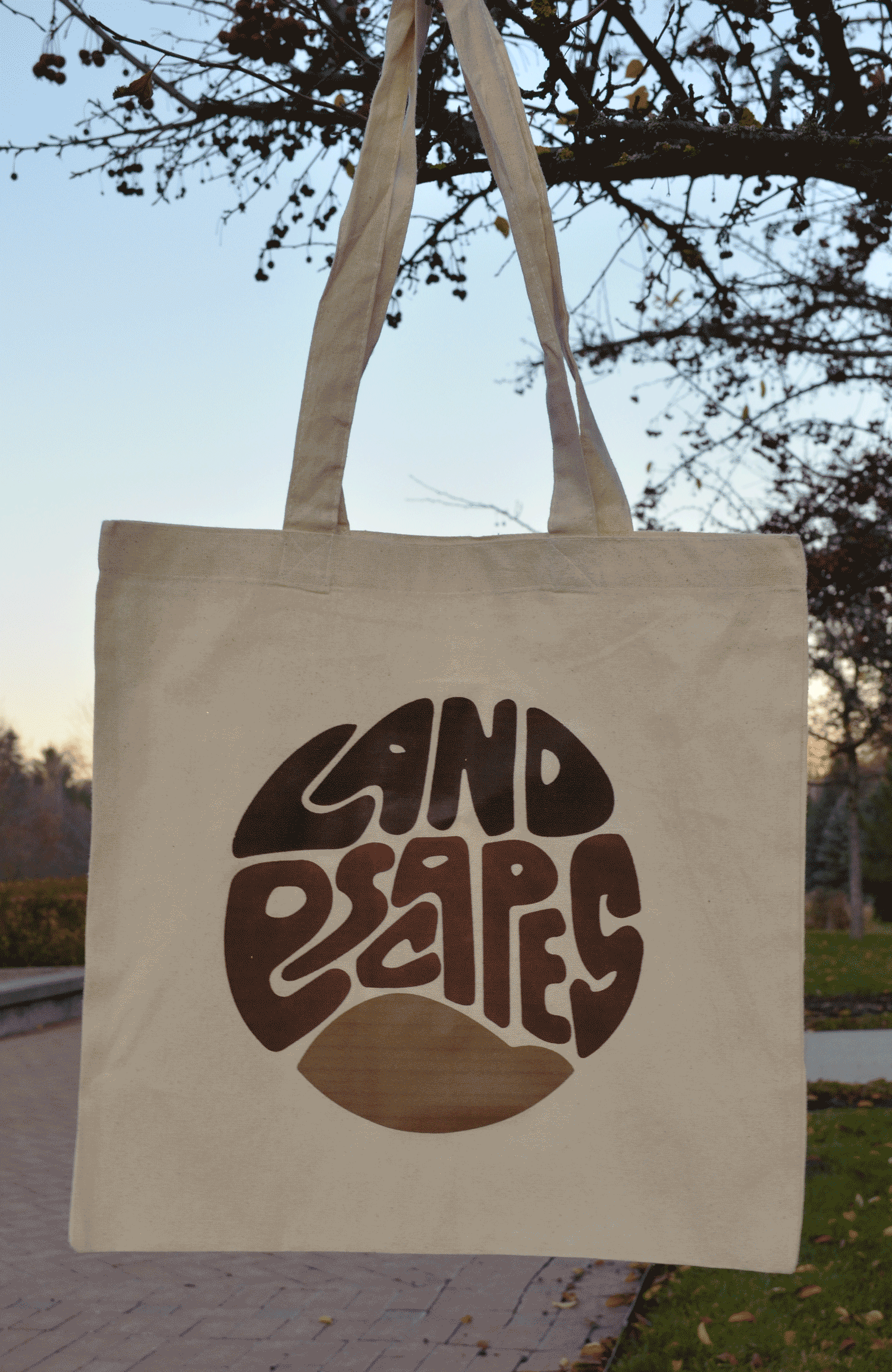
Applying this concept of easily edited designs to the rest of the merchandise was the next step. While the abstract designs paired well with the 2023 edition's colors, there wasn't a guarantee they would still look good if the colors changed. So, to test it out, I took sample colors from previous editions to ensure that the designs would hold up despite the palette change.
Once the designs were finalized, ensuring that the abstract marks would continue to look good beyond my time with LandEscapes was the next step. Ideating with the colors from previous journals is demonstrated below, with the colors from the 2020 (blue and green), 2017 (yellow and black), and 2022 edition (orange and blue), respectively.
Overall, I had a lot of fun with this project. I was able to learn new software and real-world applications through the merchandise design and creation. Working with a budget and tight schedule was also a first, and I'm confident I've grown as a professional after it.
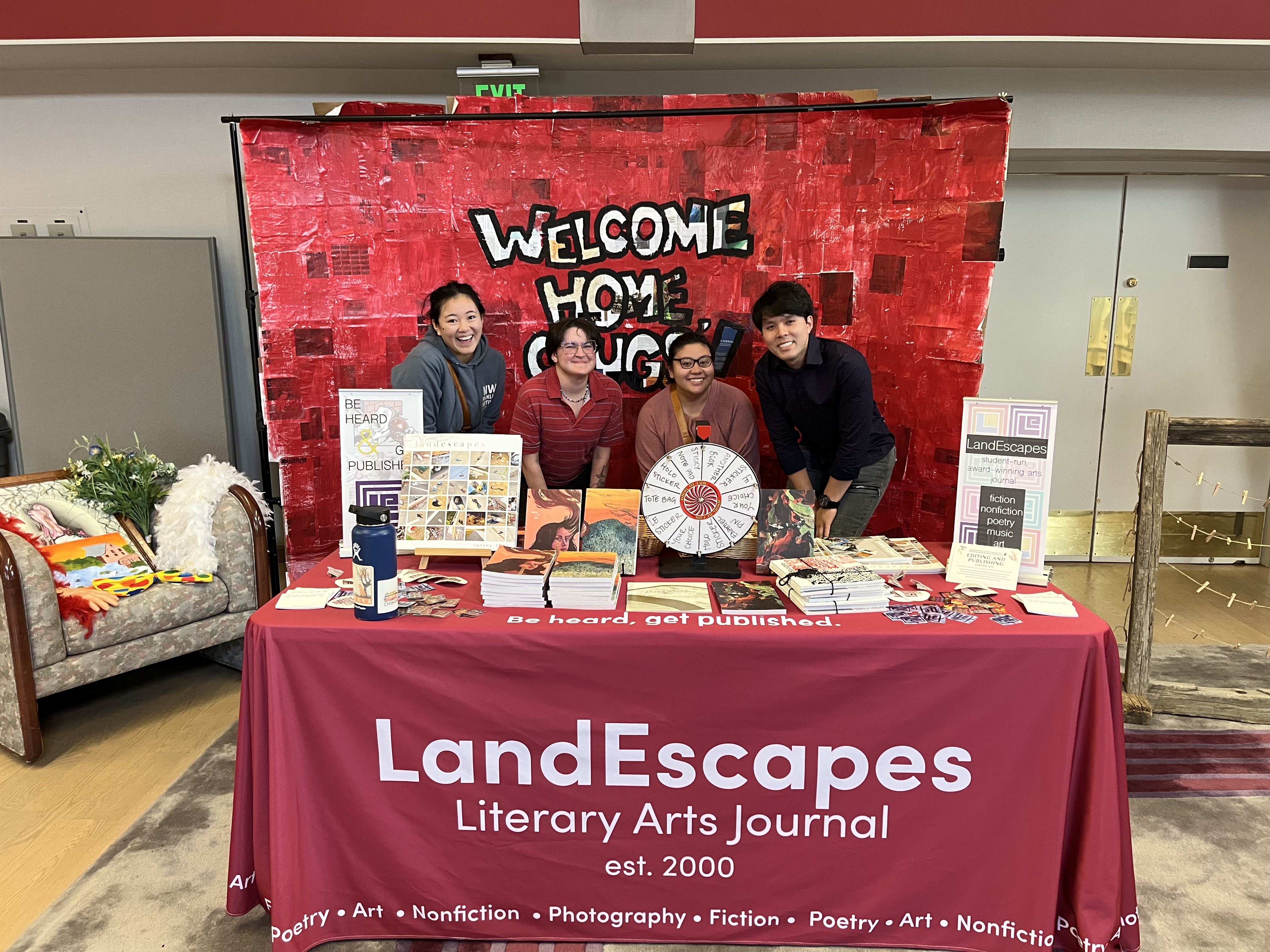
Below is a picture of the club at the first-ever Homecoming Photo Booth Competition, hosted by the Washington State University Alumni Association. It was the perfect opportunity to showcase the new LandEscapes publicly, featuring the merchandise, the new tablecloth, and the new edition.
Conceptualization, Brand Guidelines, Visual Identity, Product Creation + Design, Social Media
Photoshop, Illustrator, InDesign, Nikon D5100, sketches on a memo pad with graphite pencil
Beckham Rock, David Feston
"I’ve worked with Hannah on a variety of design based projects, most prominently designing the 2023 edition of LandEscapes as well as the merchandise for that year. Hannah excelled in this process in both her design work but also in her communication… I personally have a more base level knowledge on design terminology, and Hannah always walked me through the designs and terminology in a non-patronizing way."
Beckham Rock, co-editor in chief