Lawson Gardens
Reimagining the gardens
2023
main designer
Pullman, WA

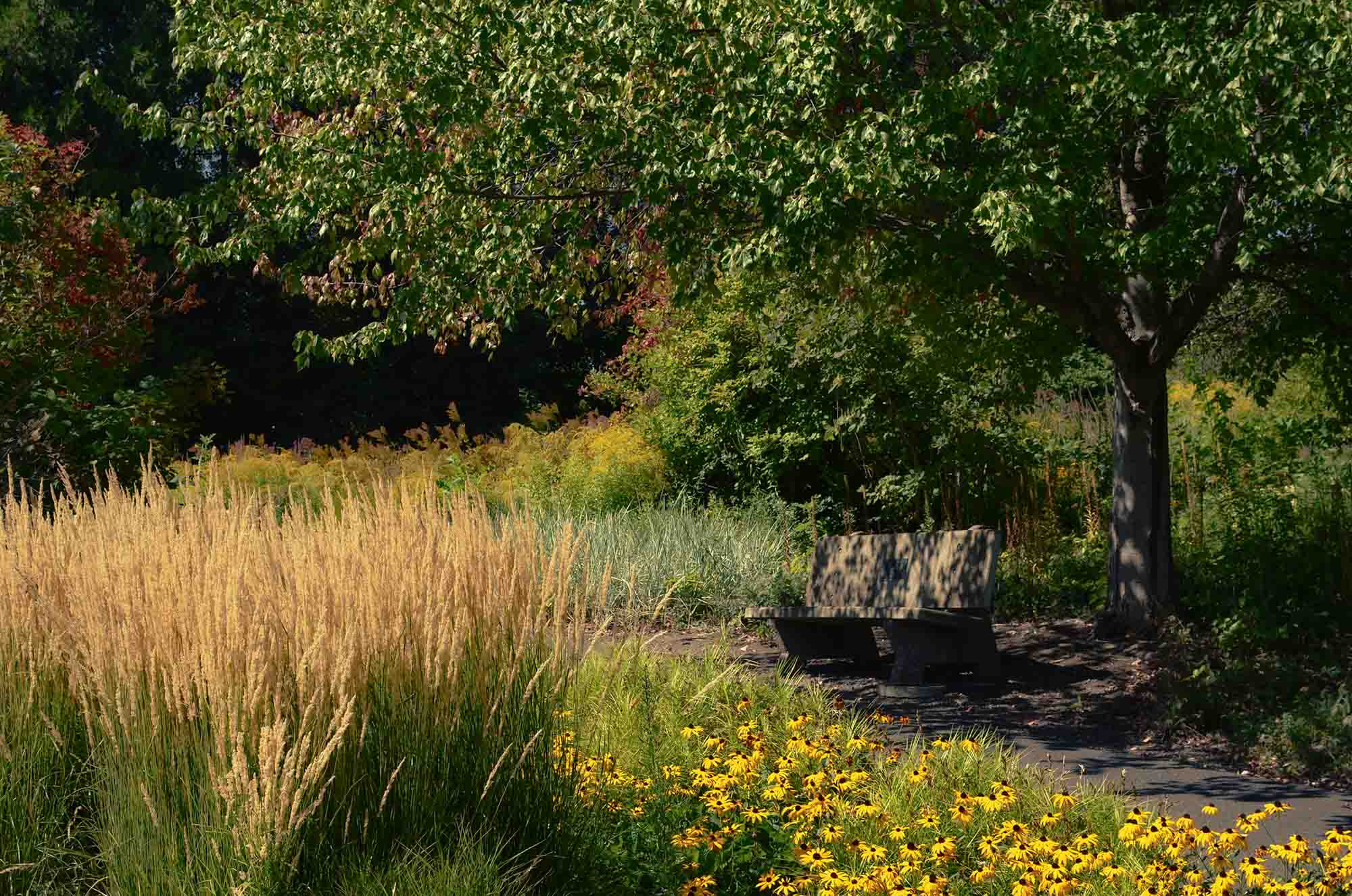
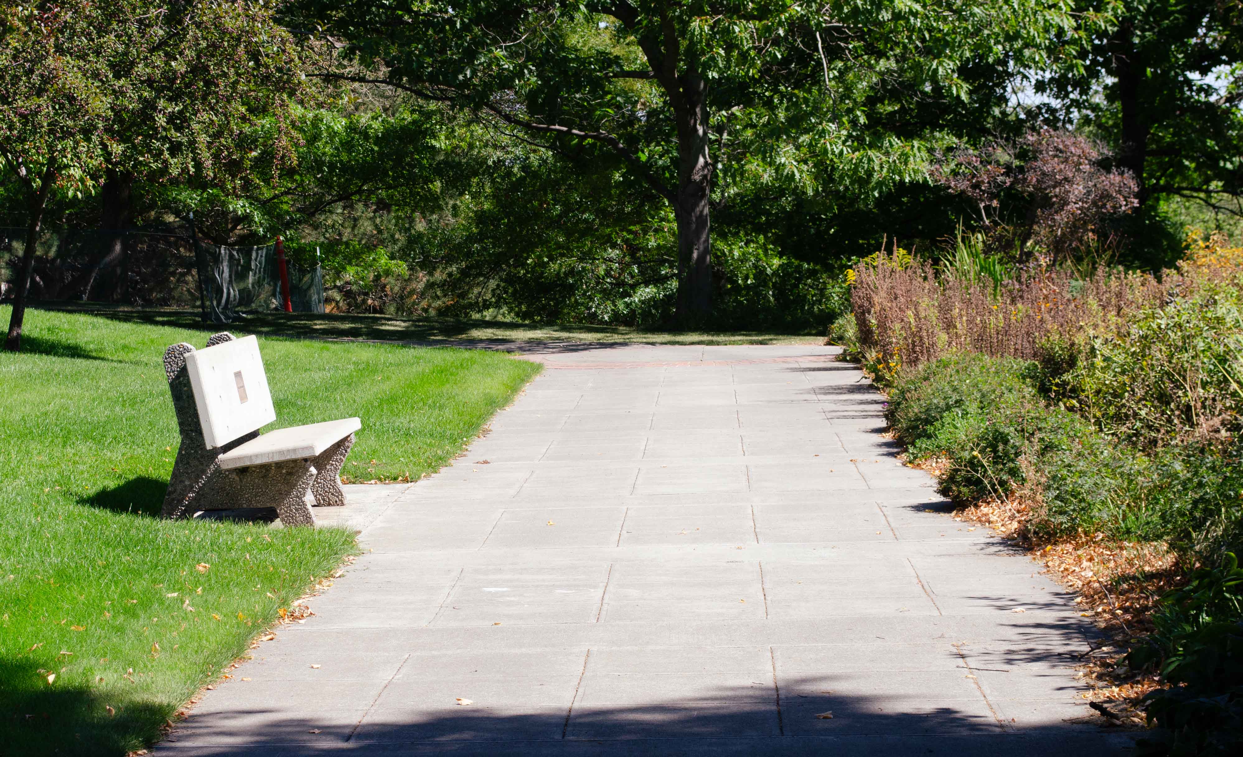
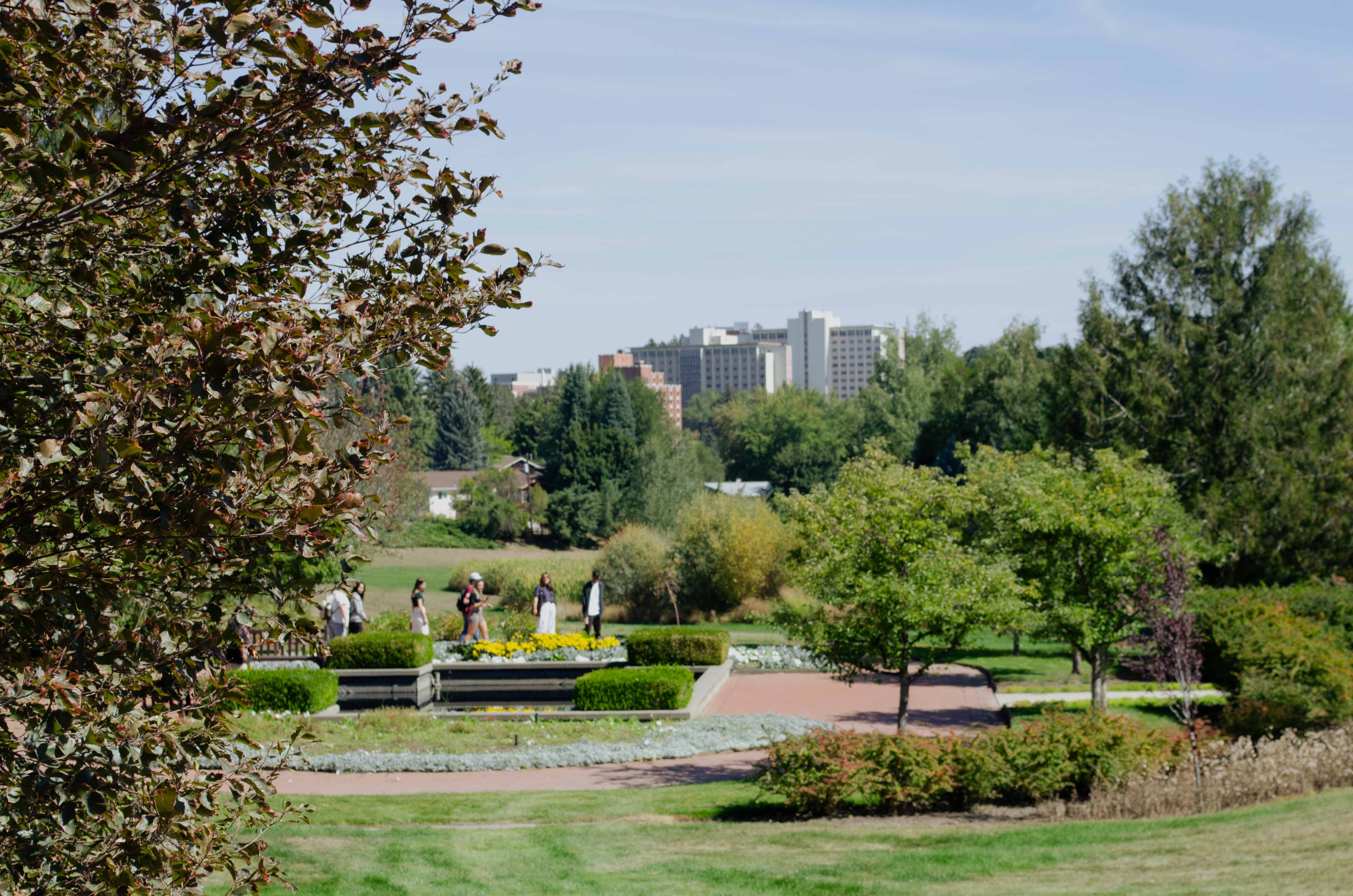
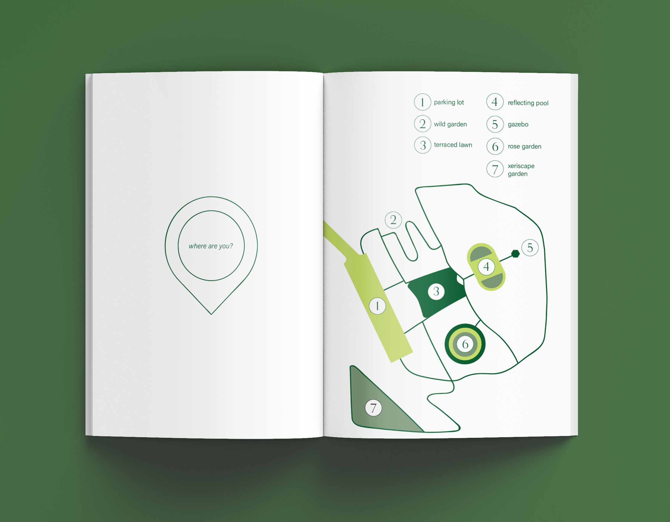
Lawson Gardens is a floral garden located in Pullman, Washington. Initially privately-owned land, in 1987 Gerald Lawson donated the park in his late wife’s honor, Alice. Since then, the Gardens have become a popular place for wedding receptions and photos due to its botanical variety. Lawson Gardens feature six unique amenities: a gazebo, a reflecting pool, a terrace, and three different gardens.
Our goal was to amplify the atmosphere of peace and tranquility within the gardens and bring more foot traffic in a non-destructive way.
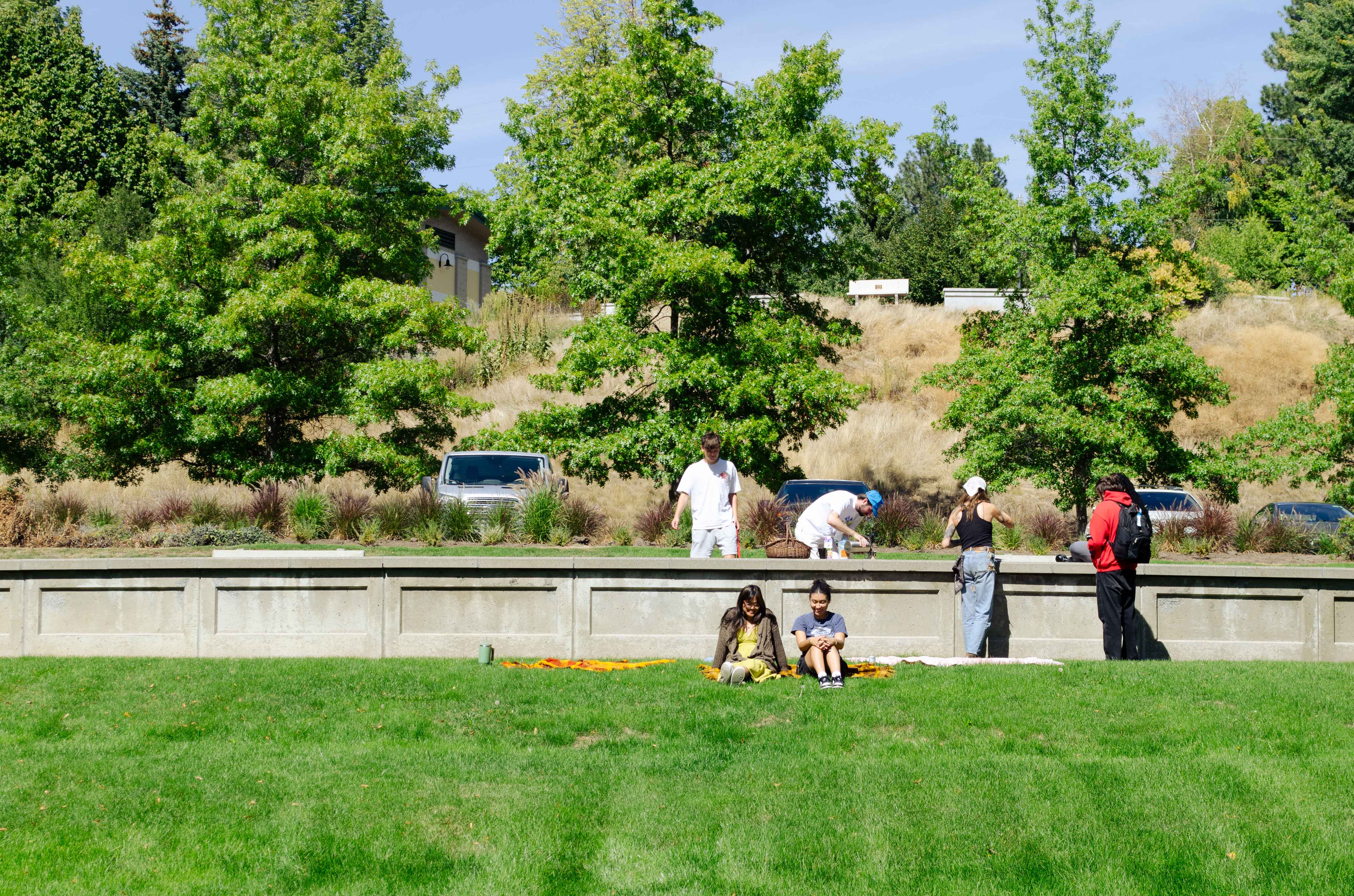


Lawson Gardens, a bountiful garden situated in a serene neighborhood atop a hill, yet merely a 15-minute walk from downtown; the buildings of the university loom over it like an incoming wave. This unique location—where it's near the students at the university and near the residents of Pullman—meant that the goal was to serve two completely different groups and match the needs that would be satisfied through the gardens.
Aiming to devise an identity for two vastly different groups of people was the goal for the team. We started off with an all-encompassing mood board, putting together a variety of photos the team had taken as well as the types of design we wanted to emanate within the project.
A majority of the favored designs were accompanied with a little write-up on why they were relevant to the project and a little pitch on why certain design styles should be pursued. Doing so helped our team members understand one another's approach to design, as well as what types of work we were all looking to do with the gardens.
We utilized Miro to create a non-hierarchical moodboard, allowing the team to add images and inspiration effortlessly. Seeing the Miro board grow during the first few weeks of brainstorming was really exciting.

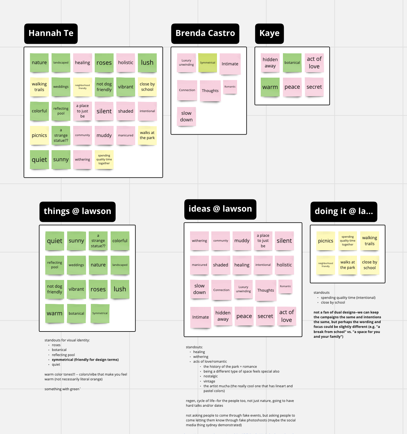
After amassing an extensive amount of design inspiration, we moved towards devising a vision statement for the work. I spearheaded a brainstorming session that started with defining keywords and phrases that we, as designers, thought of when being at the gardens. After doing this for three minutes, we moved to color-coding the keywords and phrases into:
Organizing campaign ideas in this way helped us identify different design elements we could draw from (things at Lawson), ideas we could convey in our designs via color palette or usage of negative space (ideas at Lawson) or how we could approach attracting members of the community to the space (doing it at Lawson).
The team sparsed information from the note board we'd brainstormed from at the bottom, and these phrases and ideas continued throughout the rest of the project's term, presenting themselves in our final work.
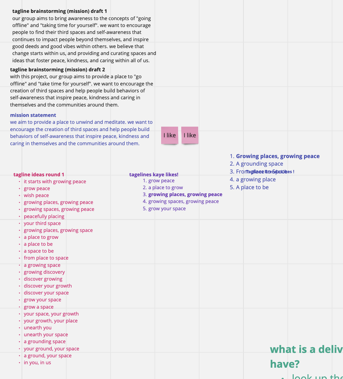
Assuming the role of copywriter, I crafted taglines for the project utilizing keywords, asking team members to choose which ones they liked the most. I also took initiative and wrote the vision statement for the team, again asking team members their thoughts on the statement in person.
From here, the team started to create different components to the final project. The design direction the team headed in focused on takeaway experiences within the gardens, specifically ones of introspective thought that encouraged reflection. To follow this ideal, the design for the experiential portion approached abstract, free-flowing design. A strategic decision was made to abstain from developing a logomark at this stage—because the gardens shouldn't be defined by anything, and instead a quiet, nondemanding space for anyone to come to.
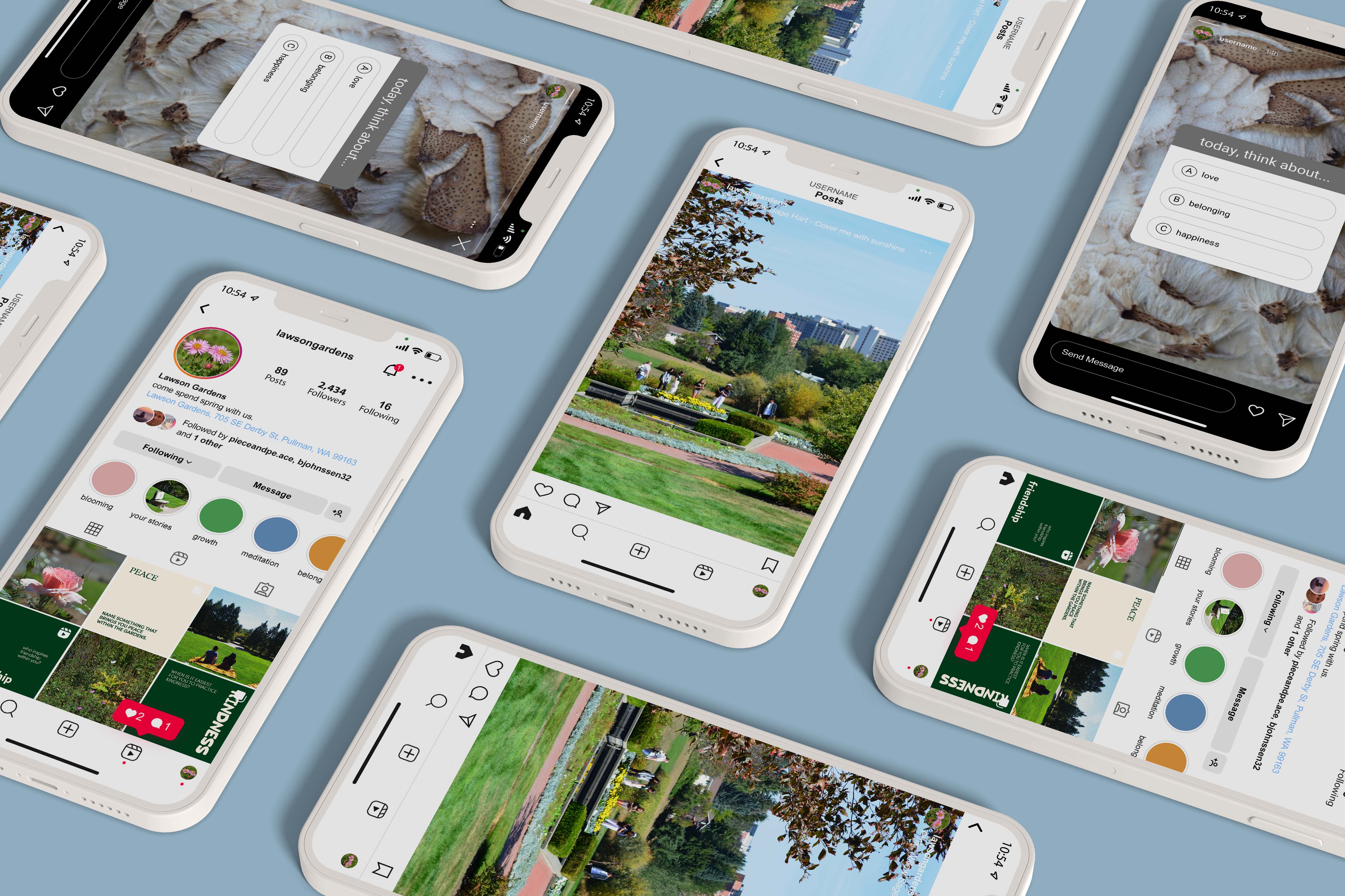
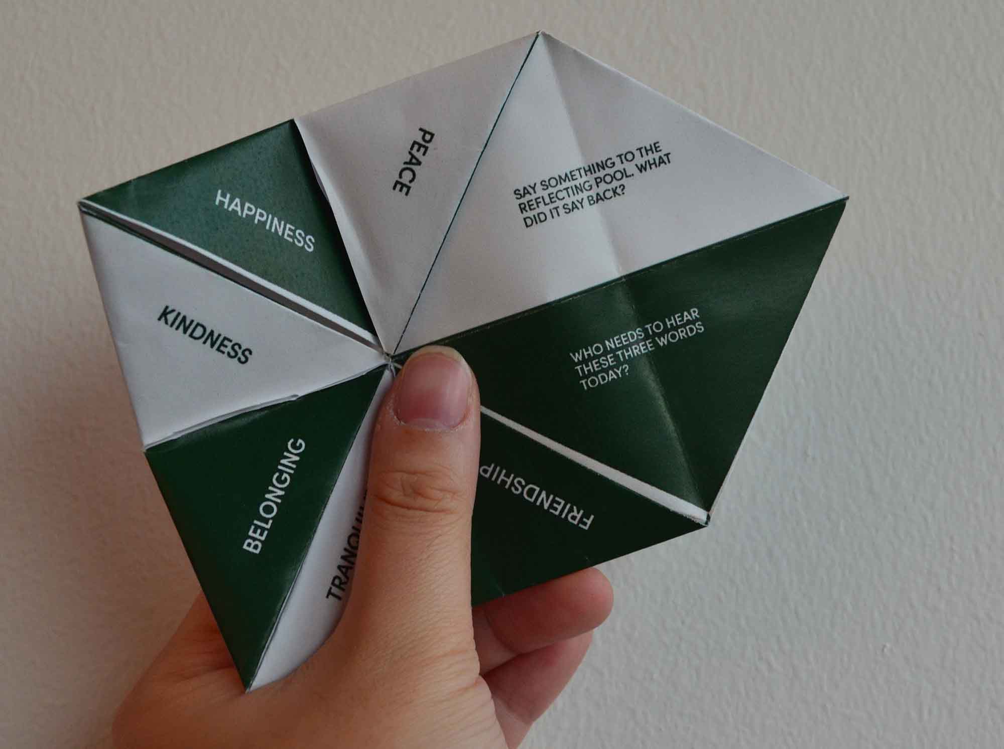
After thinking about how to craft an experience for attendees at the garden, I proposed two specific deliverables: an activity booklet that would draw attention to the themes of introspective discovery and quiet solitude and a fortune teller.
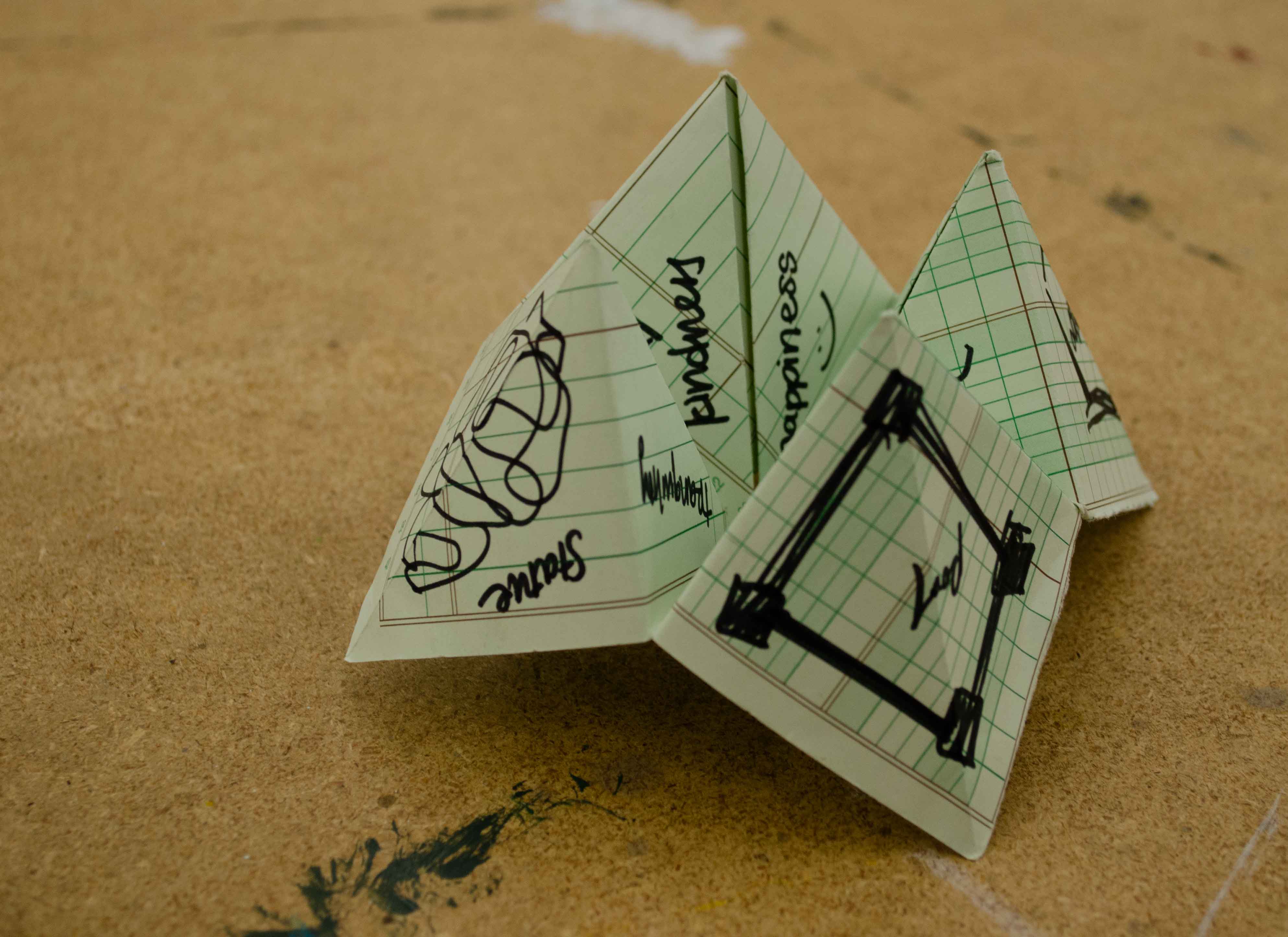
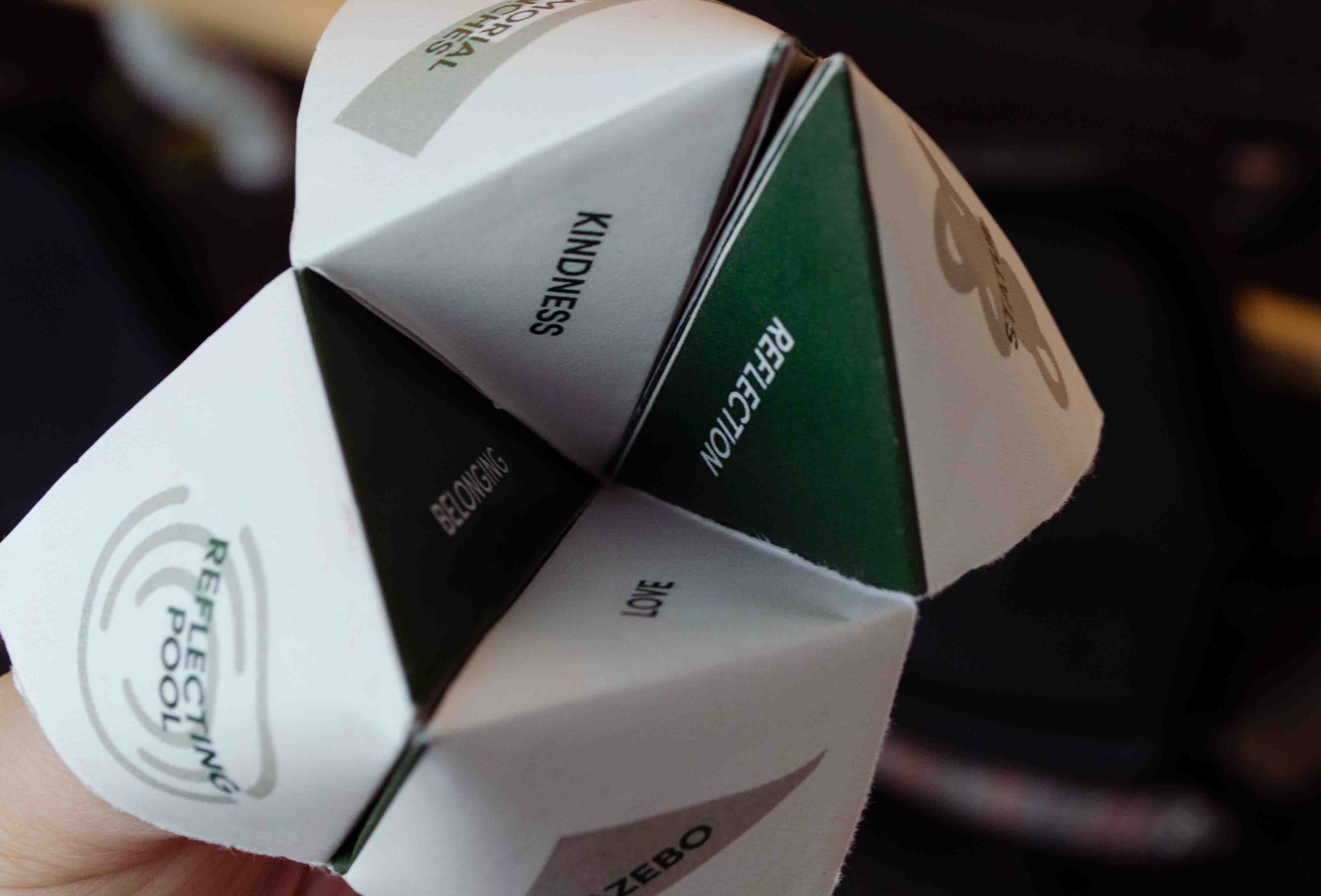
The inspiration behind the fortune teller was a environmentally low-impact activity that would stick in people's hearts beyond their time at the gardens. Utilizing four architectural components to the garden—the gazebo, the statue, the reflecting pool, and the memorial benches—I created the overarching theme for the spelling portion of the fortune teller, and then chose eight different positive attributes to ask the person about. They were friendship, tranquility, belonging, kindness, happiness, peace, reflection, and love.
Underneath each of the positive attributes was a question to prompt thinking about oneself and the community surrounding them; for example, under 'tranquility', the question is "Take a breath. What do you notice?" Simple, short questions that allow the audience to take control of their experience and their trains of thought in the garden was the driving factor for me during this portion of the project.
Therefore, when confronted with the opportunity to print my design on bandanas, I leaped at the opportunity. Combining the reflective frame of thinking with something that was multipurpose? Sold.
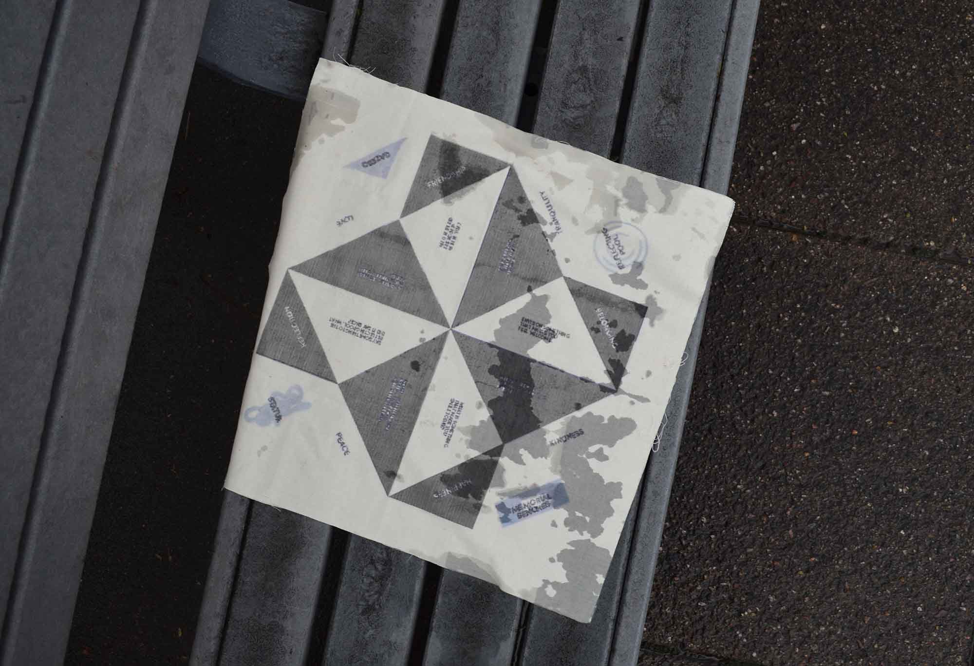
I then realized that the work I'd done for the fortune teller was already primed for a social media campaign.
Lastly, the activity booklet.
Although it was one of the original ideas from the team, the booklet was more challenging than anticipated. Where the language and design had been focused on prompting and being projectable, the activity booklet was intended to take on a more informative tone, explaining the history behind the gardens and providing direction and support for wanderers in the space.
The content the team wanted to put in the booklet was decided very early, but executing the writing, the voice, and the ethos behind the project was more difficult. What was the correct balance for our user between self-driven and guided activities?
We overcame this problem by realizing that the problem didn't need to be an expert—it needed to be a guide. The people themselves would become the experts they sought to become. This realization empowered me to explore a distinctive narrative approach within the booklet and allowed me to release some of the nagging questions that had existed throughout the process.
Articulating the essence of a space devoid of verbal expression presented a unique challenge that helped me grow as a designer in ways I hadn't expected. Contrary to my initial expectations of developing a logofolio, the final deliverable evolved into a fortune teller concept. Instead of explicit explanation, the design approach prioritized visual storytelling.
My design thinking has been expanded, thanks to the gardens.
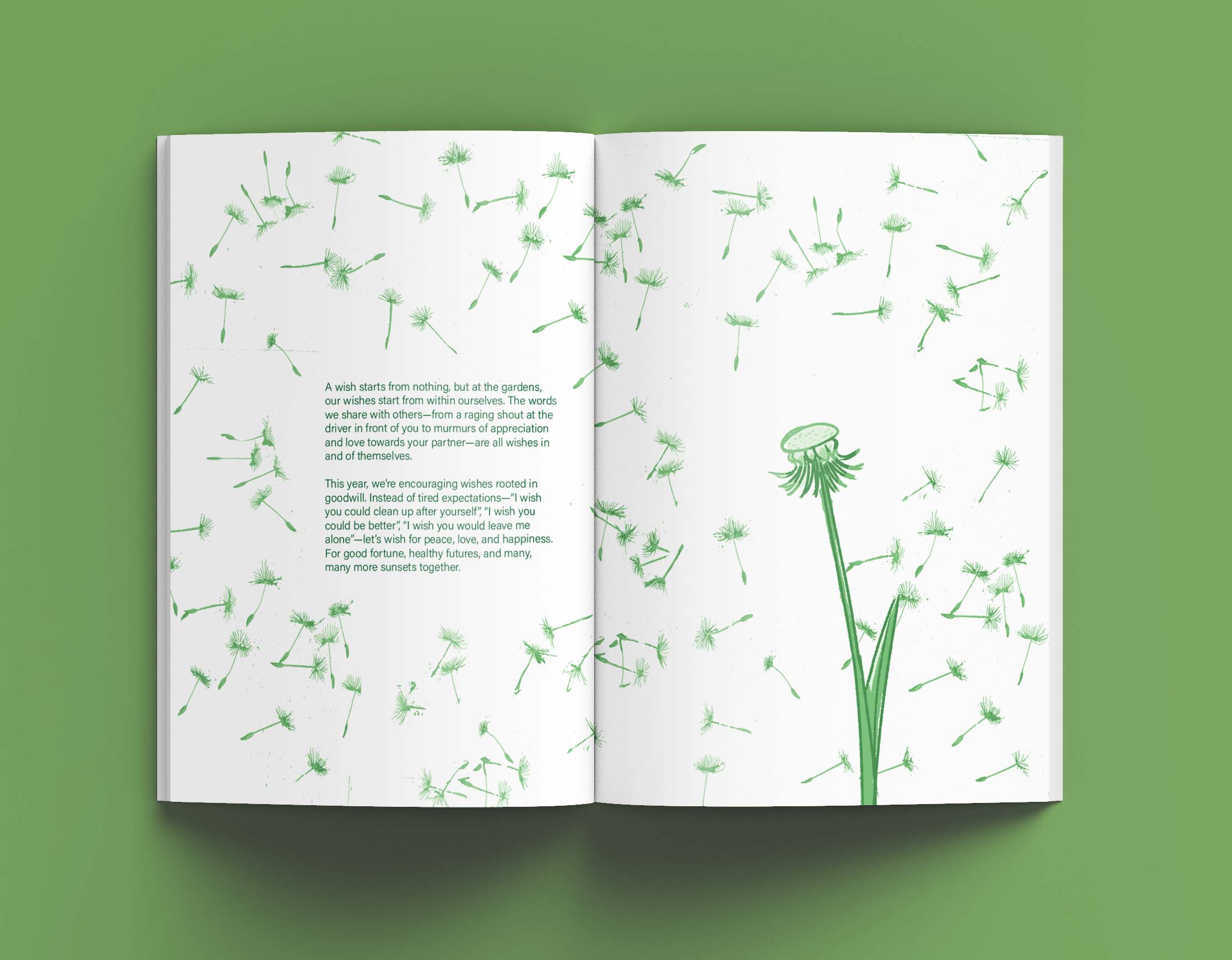
What about you? Take a seat. Tell me about it.
Conceptualization, Copywriting, Visual Identity, Packaging, Photography, Editorial, Social Media
Illustrator, InDesign, Photoshop, Miro, Nikon D5100
Kaye Paranada, Brenda Castro, June T. Sanders
"Your mind is in the right place."
June T. Sanders, project overseer